CHATEAU BORDEAUX

Experiments in home decorating, DIYing, and vintage furniture collecting.

Image Slider


A couple of months ago, I came across Hannah Hagler's blog and fell in love with her eclectic and bold sense of interior style built on her mantra that you can live a fabulous life without spending a ton of money. Hannah agreed to let me interview her and virtually tour her home, and I found lots of really great (and super affordable) ideas to file away for future projects.

 Read below for the full interview!

Finding a painting or photograph that just speaks to your soul is something that is equally amazing as it is rare. Although I'm a creative at heart and have always loved art, the hunt for meaningful and affordable pieces is extremely difficult for me. My first real apartment offered a blank slate of walls begging to be adorned, but I had no idea where to begin and couldn't bear to cover it with run-of-the-mill, mass produced faux canvases from IKEA or Target. 

I remember wishing that there was a one-stop shop where I could discover up-and-coming artists and afford to buy their work. A few months ago, I finally found it: it's called Art Crate, a genius concept founded by veteran insiders of the art world to help connect potential budget-conscious (and overwhelmed) art buyers like me with premium quality print works of individual artists that we might otherwise not discover on our own.

When Wes and I first got married, my parents drove from Chicago to Charlotte with all of my grandmother's china in tow (service for 16, no less). Since they were going to be loading up the old Kelly family van anyway, I seized the opportunity to have them transport a few things that I've always wanted to take off their hands but couldn't carry home on a plane.

Enter this chair, which has sat in my dad's basement workshop for most of my life and (literally) collected dust. According to my mom, it's a patio chair from the 1950s that used to belong to her grandmother. I love the midcentury design and that it's astonishingly comfortable for a hard shell!


One of my favorite sources for vintage inspiration in Chicago is an amazing vintage-modern shop called Humboldt House. It's one of those places where you walk in and want to live there. It's filled with amazing Chesterfield sofas, leather butterfly chairs, patina-ed credenzas and the most beautiful, unusual assortment of decor you'll ever find.


These photos are of Spruce, an amazing restaurant in San Francisco that I visited last summer: it's been the inspiration for the first dining room or study I have when I move into a place where I'm allowed to paint the walls! Here's how I would copy this look to recreate a moody and masculine room of my own:

#1 Mix rich colors, textures and tones
Like deep navy walls combined with warm camel faux ostrich leather and dark brown velvet chairs, plus touches of crisp white in the tablecloths. Think how different (and boring!) this room would be if the walls were white. 

#2 Play with proportions
The oversize sketches on the walls are hung in enormous silver frames and make an extremely bold statement. I love that they're offset with delicate, antique picture lights and ornate chandeliers. The bold look of the colors and textures is balanced with subtle touches like small, understated succulent centerpieces and minimalist place settings.

#3 Combine decor styles
It's traditional, luxurious and modern all at once, thanks to a handful of well-positioned abstract paintings on unfinished canvases. The lack of an overall theme makes it feel pulled together but not overthought, and reads masculine when combined with the bold choices in paint colors and artwork.


If you're not ready to commit to navy blue walls, get the color combination by using rich rugs, fresh white drapes, and oversize sketches sourced from Etsy and hung in silver frames.

Meanwhile, I'll get started on re-creating this look by hunting for a vintage chandelier, trying to convince my landlord to let me paint, and attempting to recover a distressed pair of studded leather office chairs that my dad pulled out of the garage and hand-delivered to our home along with other Kelly family castoffs (including at least six different types of cacti that have been flourishing* in the Chicago climate).


*They arrived drooping and nearly dead, handed off by my guilty parents who didn't want the blame for killing them off (aloe is on their hands).

Did you love this post? If yes, please follow me on Bloglovin' or join the email list for updates.

This post could have also been titled "How to not freak out about moving in to a little house of limited closet space with your big wardrobe and all of your soon-to-be husband's stuff that he can clearly live without but won't let go (see light-up beer signs and other bachelor pad horrors)."

When my husband and I were getting married, I desperately need help with this topic and sought some expertise from a professional organizer. Kim Clark, an expert at whipping cluttered messes into crisp, calm homes, helped me prepare for some of the biggest challenges to organizing our new place by suggesting some strategies and product recommendations to keep the soon-to-be Chateau Bordeaux organized.

Here are her top five tricks, in no particular order:


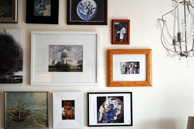
My collection of pictures and frames have followed me from my childhood bedroom to college dorms and every single one of my apartments. Whenever I move in to a new place, the first thing I do is start hanging frames on the walls - there's something comforting about being surrounded by familiar images when you are in an unfamiliar place. I have no regard for symmetry and truly hate when everything matches, so my little collection of pictures and frames fit in just right no matter where I live.


For all the charm of this little old 1930s bungalow that my husband and I rented when we first got married, the turquoise countertops were almost a deal-breaker. The kitchen was in a sad, disorganized state for months and I had no idea how to fix it.

So I decided to stop fighting it, accept those ugly laminate counters for what they were, and work with them by adding other quirky accents to liven the place up a little (and focus the eye on the white space of the pantry door).


There was awhile there at the beginning of the bar cart craze that took the world by a storm when I didn't have room for an actual cart. (I was living in a 400 square foot studio, and had to keep furnishings to a minimum for obvious reasons.) However, what do you do when you want all of the entertaining joys that come with an organized bar setup, but don't have the cart?

My friends, you look to Craigslist and search "cart." It's amazing the solutions that will populate before your very eyes. After thorough Craigslist research, I finally settled on a tea cart that doubles as a side table to save space. It worked perfectly! I bought the antique brass cart from a little old lady who was downsizing and very happy to help me load it into my Honda Civic. To keep the "bar cart feel", I decided to style my tea cart with old bamboo tray from Target and filled it with assorted Homegoods tumblers, shot glasses, and a fantastic stainless ice bucket. I ordered a matching stainless bar shaker set on eBay for $0.99. I used the top of this cart to display an antique camera and long lens, Restoration Hardware sterling silver candlesticks (that I found at a consignment shop for $1 apiece) and an orchid that died almost immediately due to my black thumb.


In my research, I found a few other ideas for bar-but-no-cart designs, and one of my favorites was this antique buffet-turned-bar. I love the bright green tray and think the bar tray idea works perfectly here! (The giant gold mirror, symmetrical lamps, and ceramic Turkish end tables tucked underneath the credenza are all amazing.)


Photo via Appollinas

Did you love this post? If yes, please follow me on Bloglovin' or join the email list for updates.

Vintage is just a fancy way of saying really old, and very used - both qualities that I prioritize when hunting for furniture. I am anti-Ikea. For some reason, it is important to me that my furniture has character. This dresser has plenty. But there's more than just character that makes vintage furniture such an amazing addition to a room. Here are just a few reasons to consider: